Post Office rolls, with a few exceptions, were identified by a stock letter. The letter identified the denomination of the stamps, the number of stamps, and the method of delivery (which implied the intended affixing or vending machine).
Initially letters were allocated sequentially but over time, as some rolls were discontinued and new rolls issued, the allocation became somewhat random. Once all single letters had been used (only 25 as (I) was never used), double letters were allocated: (AA), (AB), etc.
Rolls in Multiples of 500
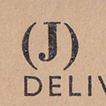
The first Post Office rolls issued in September 1912 were lettered (A-H). When the postal rate increased to 1½d in June 1918 rolls (JKLM) were issued. These were followed by rolls (QRS) when the rate increased to 2d in June 1920 and, at the same time, rolls (CAJ) were discontinued due to insufficient demand.
| Michelius | POKO | FIXO | Multipost | |
|---|---|---|---|---|
| 1,000 | 1,000 | 500 | 500 | |
| ½d | C | D | G | H |
| 1d | A | B | E | F |
| 1½d | J | K | L | M |
| 2d | — | Q | R | S |
Rolls in Multiples of 240
Rolls in multiples of 240, which seems sensible as there were 240 pennies to the pound, were first issued for sideways delivery in 1920 (PONT). The corresponding (HFMS) rolls were discontinued at the same time. These discontinued letters (CAJ) and (HFMS) were later reused for higher denomination rolls.
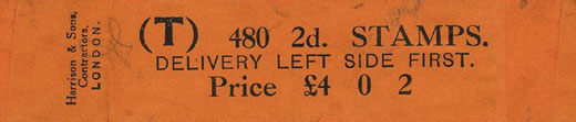
When Waterlow took over the printing contract in 1924, the remaining letters (DBKQ) and (GELR) were changed to 960 and 480 stamps respectively.
| Post Office Vending | POKO | FIXO | Multipost | |||||
|---|---|---|---|---|---|---|---|---|
| 240 | 480 | 960 | 1,920 | 480 | 960 | 480 | 480 | |
| ½d | AA | G * | W | Y | — | D | G * | P |
| 1d | AB | E * | X | Z | — | B | E * | O |
| 1½d | — | — | — | — | — | K | L | N |
| 2d | — | — | V | — | — | Q | R | T |
| 2½d | — | — | — | U † | — | F | — | M |
| 3d | — | AC | AD | U † | — | C | — | S |
| 4d | — | — | — | — | — | A | — | H |
| 5d | — | — | — | — | — | AE | — | AF |
| 6d | — | — | — | — | J | — | — | — |
* rolls (GE) were changed from FIXO to P.O. Vending in 1935.
† 3d (U) rolls replaced 2½d (U) rolls in Nov 1957 keeping the same letter.
Stock Letters
The table below summarises the stock letters used by the Post Office. Dates of issue are fairly well known, but dates of withdrawal are more difficult. Often the Post Office would announce that a roll was discontinued but then keep supplying it until stocks were exhausted. This could be a year later, or even a few years for less popular rolls.
| A | 1912-1921 | 1d | 1,000 | Top End |
| 1950-1971 | 4d | 960 | Lower End | |
| B | 1912-1924 | 1d | 1,000 | Lower End |
| 1928-1963 | 1d | 960 | Lower End | |
| C | 1912-1921 | ½d | 1,000 | Top End |
| 1932-1967 | 3d | 960 | Lower End | |
| D | 1912-1924 | ½d | 1,000 | Lower End |
| 1927-1963 | ½d | 960 | Lower End | |
| E | 1912-1924 | 1d | 500 | Top End |
| 1925-1935 | 1d | 480 | Top End | |
| 1935-1968 | 1d | 480 | Lower End | |
| F | 1912-1921 | 1d | 500 | Lower End |
| 1929-1963 | 2½d | 960 | Lower End | |
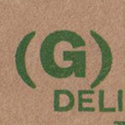
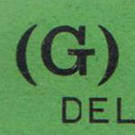
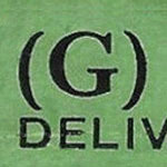
| G | 1912-1924 | ½d | 500 | Top End |
| 1926-1935 | ½d | 480 | Top End | |
| 1935-1968 | ½d | 480 | Lower End | |
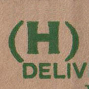
| H | 1912-1921 | ½d | 500 | Lower End |
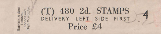
| 1950-1971 | 4d | 480 | Left Side | |
| J | 1918-1921 | 1½d | 1,000 | Top End |
| 1939-1971 | 6d | 480 | Lower End | |
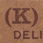
| K | 1918-1924 | 1½d | 1,000 | Lower End |
| 1925-1956 | 1½d | 960 | Lower End | |
| L | 1918-1924 | 1½d | 500 | Top End |
| 1925-1958 | 1½d | 480 | Top End | |
| M | 1918-1921 | 1½d | 500 | Lower End |
| 1935-1965 | 2½d | 480 | Left Side | |
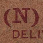
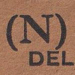
| N | 1920-1968 | 1½d | 480 | Left Side |
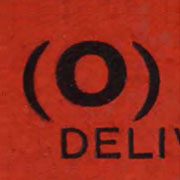
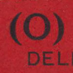
| O | 1920-1968 | 1d | 480 | Left Side |
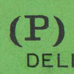
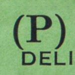
| P | 1920-1960 | ½d | 480 | Left Side |
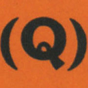
| Q | 1920-1924 | 2d | 1,000 | Lower End |
| 1929-1965 | 2d | 960 | Lower End | |
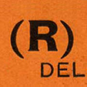
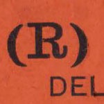
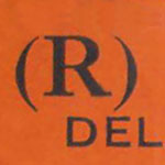
| R | 1920-1924 | 2d | 500 | Top End |
| 1925-1967 | 2d | 480 | Top End | |
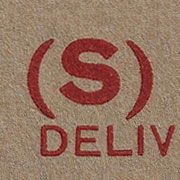
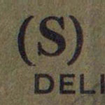
| S | 1920-1921 | 2d | 500 | Lower End |
| 1935-1971 | 3d | 480 | Left Side | |
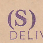
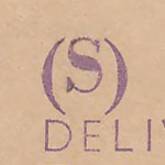
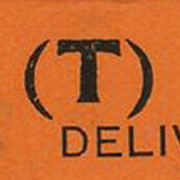
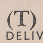
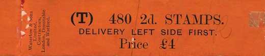
| T | 1920-1971 | 2d | 480 | Left Side |
| U | 1949-1957 | 2½d | 1,920 | Lower End |
| 1957-1971 | 3d | 1,920 | Lower End | |
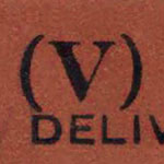
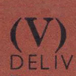
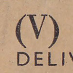
| V | 1949-1971 | 2d | 960 | Lower End |
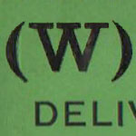
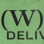
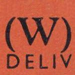
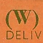
| W | 1928-1968 | ½d | 960 | Lower End |
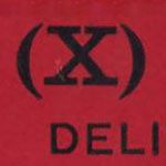
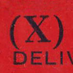
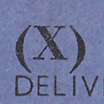
| X | 1928-1971 | 1d | 960 | Lower End |
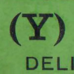
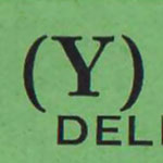
| Y | 1928-1968 | ½d | 1,920 | Lower End |
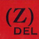
| Z | 1928-1971 | 1d | 1,920 | Lower End |
| AA | 1954-1965 | ½d | 240 | Lower End |
| AB | 1954-1965 | 1d | 240 | Lower End |
| AC | 1960-1968 | 3d | 480 | Lower End |
| AD | 1960-1968 | 3d | 960 | Lower End |
| AE | 1968-1971 | 5d | 960 | Lower End |
| AF | 1968-1971 | 5d | 480 | Left Side |
Styles
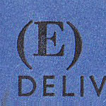
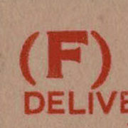
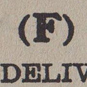
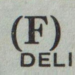
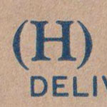
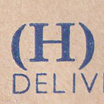
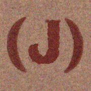
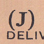
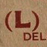
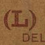
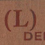
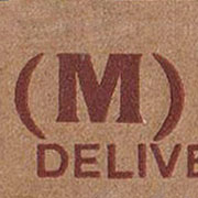
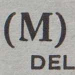
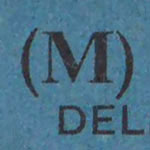
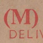
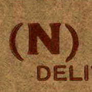
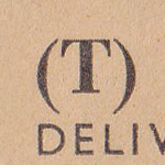
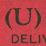
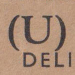
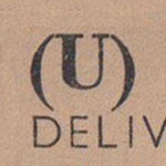
The styles used for leaders varied over time. The fonts used for the stock letter, for the delivery clause, and their relative positions, can be used to identify the issue.
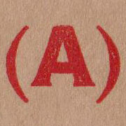
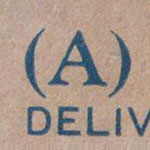
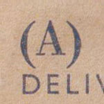
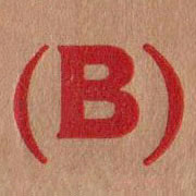
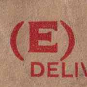
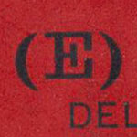
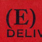
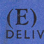
Style a: 1912 Harrison. Stock letters have small glyph serifs, similar to Copperplate Gothic, and are considerably larger on rolls of 1,000 than on rolls of 480/500. The STAMPS line and Price line are Caslon Bold. The delivery clause is probably Akzidenz-Grotesk (aka Basic Commercial), a popular sans-serif font of the period, a forerunner to modern Swiss styles, with wide capitals E and F.
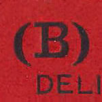
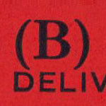
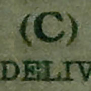
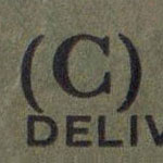
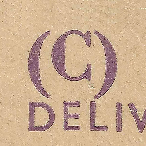
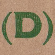
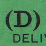
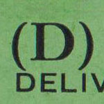
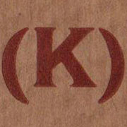
Style b: 1924 Waterlow. Stock letters are changed to Typewriter with square serifs. All are now the same size, slightly larger than the rest of the “STAMPS” line, which is probably Monotype Modern. (C) and (F) are exceptions, they were introduced late in the period with a style of their own.
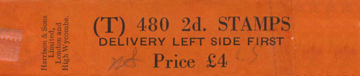
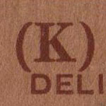
Style c: 1934 Harrison. Stock letters are changed to the same “roman” style as the rest of the “STAMPS” line, probably Monotype Modern.
Style d: late 50s Harrison. The delivery clause is reset with narrow E’s, possibly Futura, a sans-serif font with narrow capitals E and F.
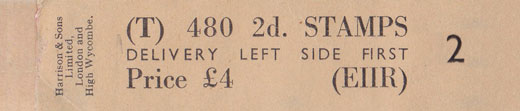
Style e: 1960s Harrison, with Royal Cypher “(EIIR)” from 1966, and “(QE II MACHIN)” from 1968. Stock letters are smaller, now the same size as the rest of the “STAMPS” line.
Alphabets
1912 Harrison
Gothic
1924 Waterlow
Typewriter
1934 Harrison
Wide E
1950s Harrison
Narrow E
1960s Harrison
Smaller Letters